Time To Be Responsive - We Also Mean the Website!
on May 28, 2014
First you needed 'a website', then came 'a well-designed website', further came 'a website with call-for-action' and just like humans, it keeps evolving to get better and better every day. Significantly in the last decade, website development has undergone a complete transformation.
Before the advent of smartphones and tablets, all that web designers had to worry about was to keep a standard look and feel across all desktops. With various sizes that the new age phones come in, it is practically impossible for brands and companies to create a different site for each varying size. Not to forget the cost component while even considering a few standard sizes. So, what is the solution?
The answer to this is a responsive website (please do not confuse- we are not saying a mobile site).

Brands over the last couple of years have been skeptical about going for a responsive website. The growing usage of mobile devices to surf websites across all verticals has forced some brands to go responsive. The technologies like 3G and advanced internet connectivity for mobile devices have contributed a lot for the same.
And now, with Google's announcements around penalizing websites which are non-mobile compatible from an SEO rankings perspective (or rewarding those that are compatible), the choice for brands has become very straight-forward. GET A RESPONSIVE WEBSITE! Even the forecasts of usages of mobile devices in future to access internet are really encouraging to go responsive.
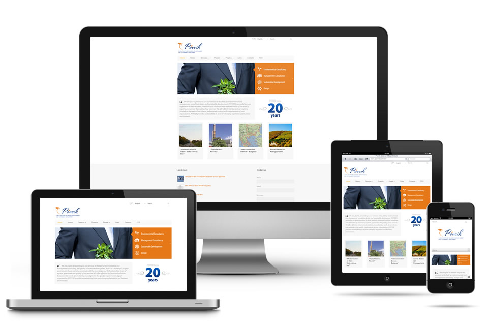
A responsive website follows a design approach wherein the website can automatically adjust itself to any screen size, thereby providing easy accessibility via all devices.
Here are a few benefits of having a responsive website, besides it being cost effective.
- Optimal User Experience - Content rules. But without a good user experience content wouldn't be able to hold on to the visitors. What people want is convenience to access the content wherever they want, and on a device of their choice.
- Passes Mobilegeddon Test - A responsive website meets the requirements of the recent Google Analytics for mobiles and tabs that require websites to be mobile-friendly.
- SEO Friendly - Two different websites mean two different URLs and increased burden on SEO initiatives. Also, a single site helps avoid any kind of duplicity in content or otherwise.
- You have the control- with a responsive design, you have control on what to show on a full desktop device and what elements to show if the browsing is happening on a tablet or mobile. Also you get to choose the priority content and its placement.
- Cost advantage- If you are using a responsive design then you save on the cost which you would have spent on having a separate mobile website. Managing the communication is also easy as it goes to only one location.
- Technologically advanced- The whole coding and scripting in responsive design is advance so you need not worry about getting right resources and scripts when you are ready for any upgrade is future, your code will be useful at that time.
Brands are fast acknowledging the importance of a website going responsive. We are proud to take the official website for HBO responsive. Users will now be able to have a seamless experience, see schedules and information about the movies they love and keep in touch with their favorite English movie channel.
It's time newer players understand it beforehand and start with the responsive approach. Please do not forget to contact us if you require any web or application design/development services.
Post a comment
0 comments
Recent Post
.png)
.png)


More Stories


.jpg)


Copyright © 2025 - OMLogic Blog. All rights reserved.
Sorry! No comment found for this post.